Revive Campa Cola, a legacy Indian soft-drink brand
CLIENT
Reliance Consumer Products
ROLE
Director, Brand & Design
TYPE
Brand Identity, Visual Language, Packaging Design, Architecture
AGENCY
Elephant Design

CHALLENGE
Acquired by Reliance after its 90s decline, the task was to rebrand focusing on differentiation and legacy preservation to revitalize Campa's image, and position it as an alternative to multinational giants like Coca-Cola and Pepsi.
Could we leverage Campa Cola's iconic status, emphasizing its unique fruity and spicy flavor, and nostalgic associations from the 80?
STRATEGY
The reimagined brand had to strongly resonate with contemporary India's young, ambitious population. Today’s Campa ties firmly into the story of an emergent India focusing on authenticity, drive, and self-expression.
The brand promises to refresh and revitalize consumers, appealing to their bold, unapologetic nature and desire for authentic experiences.


DESIGN
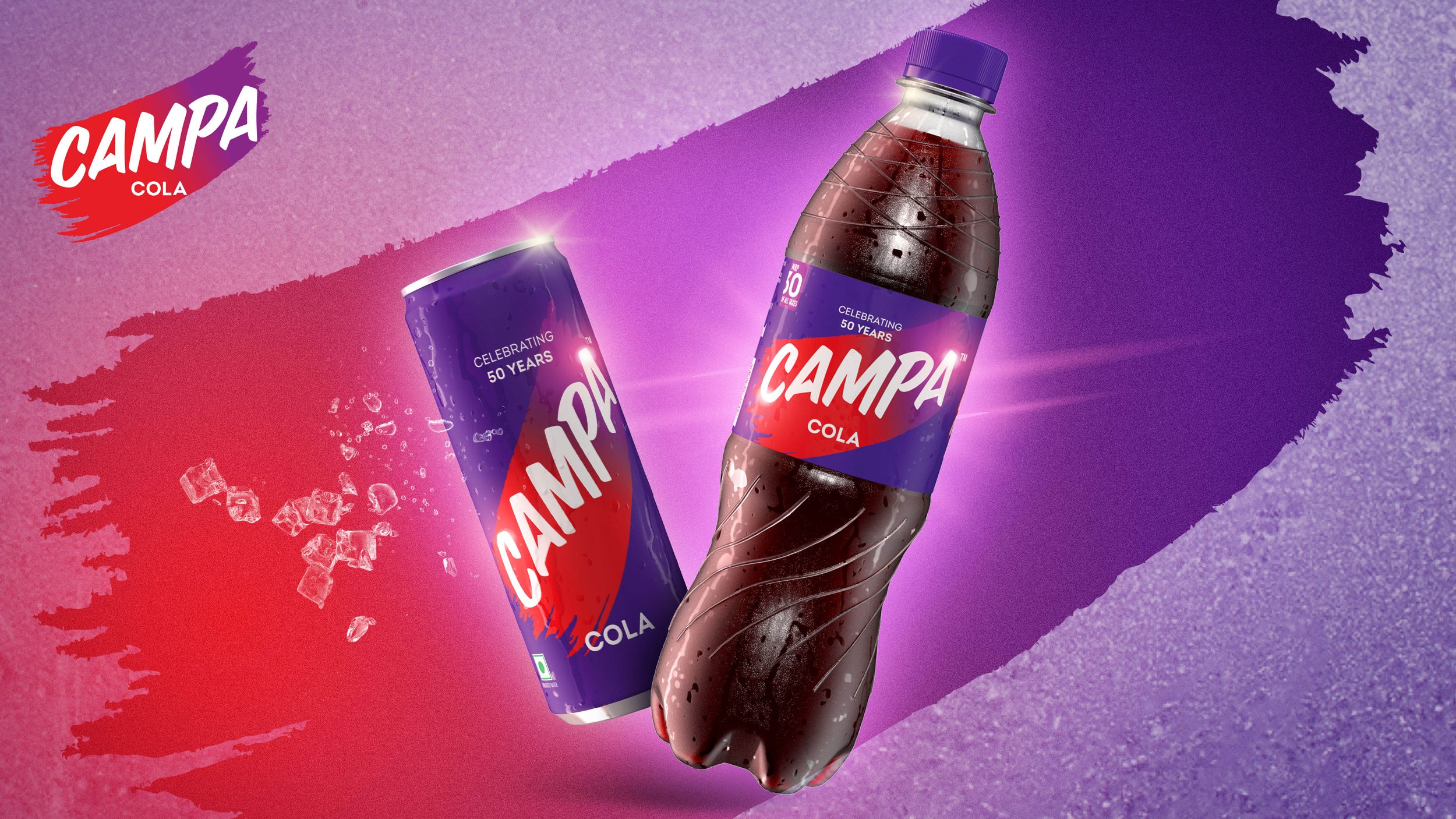
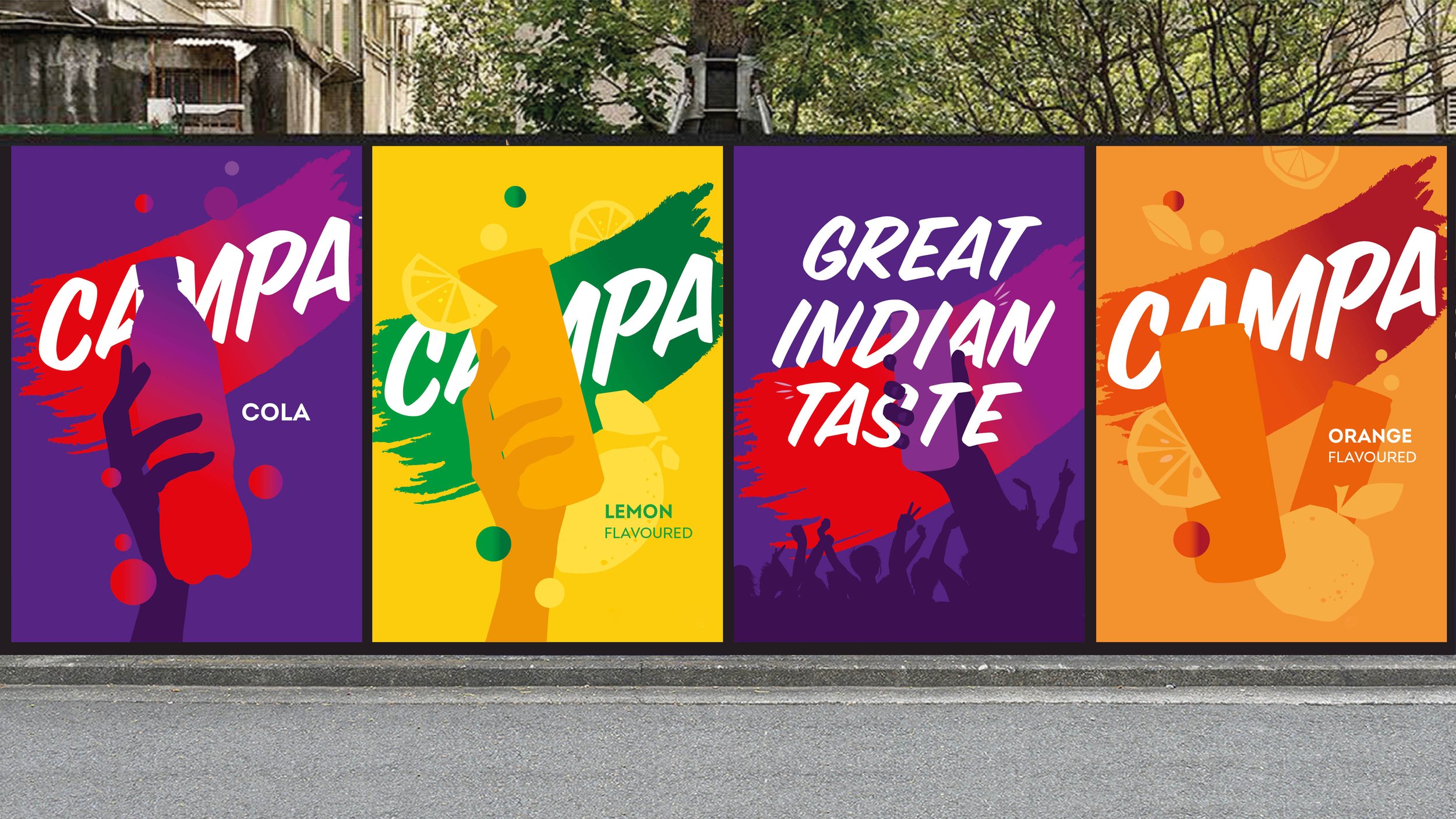
Campa’s revival struck a balance between legacy and innovation, emphasizing Campa's 50-year legacy and ‘great indian taste’ in a confident style. The visual identity features a dynamic swoosh of color paired with a contemporary logotype. The element of wiping a chilled can to reveal the brand symbolized Campa's hero archetype, an invitation to live life to the fullest.
The use of purple and bold red in the 'swoosh' , challenged industry norms ad added an aspirational touch, solidifying Campa's image as an unconventional brand. The flexible packaging system and adaptable colour combinations, accommodated a diverse flavor line up seamlessly, maintaining visual coherence and catering to evolving consumer demands.


